Modern decor in 2026 is no longer just about choosing a style from a catalog. The interiors that work today layer pieces from varied origins, abandon golden finishes in favor of chrome, and swap sage or terracotta hues for deeper browns. Three concrete shifts are redefining the way we conceive a living space.
Mirror chrome and metallic finishes: the shift that modern decor imposes on lighting and furniture
Brushed brass and golden accents have dominated interiors for several years. This cycle is coming to an end. Mirror chrome is gradually replacing golden touches on coffee table legs, pendants, and small decorative objects.
The difference is not just in color. Chrome reflects light in a more neutral way, making it compatible with deep color palettes (chocolate browns, wine reds) without creating awkward warm-cool contrasts. A golden leg on a dark walnut piece produces an opulent, sometimes dated effect. The same leg in mirror chrome anchors the piece in a more understated contemporary register.
We recommend starting the transition with lighting, which can be easily replaced without touching the larger furniture. A chrome pendant or table lamp is enough to refresh the look of an entire room. To discover decoration on Déco Maison, this shift towards chrome serves as a good entry point to test new finishes without heavy commitment.
Style collected over time: composing a modern interior without buying everything at once
Overly coordinated interiors are losing ground. The collected over time trend involves gradually assembling new furniture, second-hand pieces, and personal objects to create a space that tells a story rather than a catalog page.
This is not about embracing chaos. The coherence relies on a subtle common thread: a limited color palette, a recurring material (dark wood, for example), or a constant proportion between solid volumes and empty spaces. The result appears spontaneous, but the underlying structure remains rigorous.
How to avoid the flea market effect
The classic trap is to accumulate without hierarchy. Three technical rules maintain readability:
- Limit the visible wood species to two or three in the same room, favoring similar tones (walnut and chestnut work well together, bleached oak and wenge contradict each other).
- Reserve highly decorative objects (handcrafted ceramics, ethnic textiles, vintage posters) for one or two focal points per room, no more.
- Keep a neutral background on large surfaces (walls, floors) so that the pieces accumulated over time do not visually saturate the space.
A collected over time interior succeeds when it is not obvious that it was designed. It is the tension between apparent spontaneity and hidden structure that holds the whole together.
2026 Color Palette: chocolate browns and deep reds replace sage and terracotta
Sage green and terracotta have marked recent seasons. These shades are receding in favor of chocolate browns, available in chestnut and hazelnut, and deep reds like wine. The change is not just a passing trend: it accompanies the return of dark wood in furniture.
A wall painted in matte chocolate brown absorbs light very differently than a terracotta wall. The ambiance shifts from Mediterranean to something more subdued, more Nordic in spirit. North-facing rooms, often avoided for dark colors, gain depth with these shades instead of appearing dull.

Pairing these shades with existing furniture
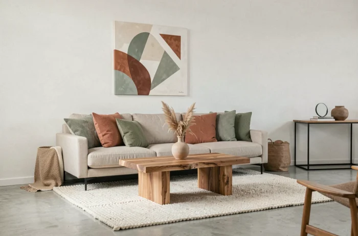
A medium gray sofa, very common in French interiors, naturally pairs with a chestnut wall and burgundy cushions. The gray serves as a neutral base, the brown structures, and the red punctuates. We observe that this combination works better than the gray-sage-terracotta trio that dominated recently, as the tonal contrast is more pronounced without resorting to bright colors.
For light wood furniture (oak, birch), transitioning to chocolate brown on the walls creates a framing effect that highlights the furniture by contrast. The opposite also works: a dark walnut piece against an off-white background produces a sharp graphic effect, typical of current design.
Materials and textures: the return of matte against all-lacquered
Matte surfaces are gaining ground in interior decoration, from kitchen fronts to coffee tables. Matte absorbs fingerprints, reduces distracting reflections, and gives materials a more tactile presence. This is not just an aesthetic choice: a matte finish ages better than a glossy lacquer that shows marks at the slightest micro-scratch.
Waxed concrete, raw stone, and textiles with visible weaves (thick linen, boucle wool) share this matte quality. Their common point is to engage touch as much as sight. In an interior dominated by screens, this sensory dimension becomes a real criterion for choosing furniture and coverings.
- Storage fronts in matte MDF tinted in the mass rather than glossy lacquered.
- Countertops in softened natural stone (leather or brushed finish) rather than polished mirror.
- Upholstery textiles with visible texture: wrinkled linen, wide corduroy, felted wool.
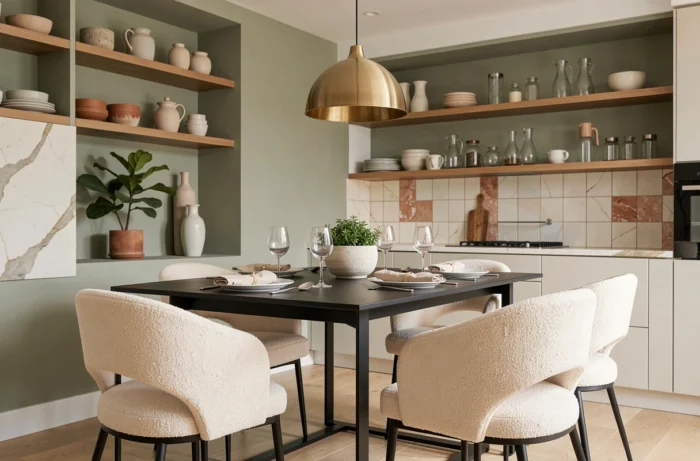
The combination of matte and mirror chrome, seemingly contradictory, works precisely because the contrast is embraced. A chrome light fixture above a matte brushed oak table creates a sharp point of light in a textured ensemble. It is this play of contrasts, rather than uniformity of finish, that characterizes modern decor in 2026.
The most accomplished interiors this year share a common trait: they mix elements that, taken individually, do not seem to go together. Chrome and raw wood, deep brown and neutral gray, a flea market find and contemporary design. Coherence no longer comes from matching, but from mastering proportions and contrasts.